
Vowelskin
Brand Identity and Packaging
Tech Stack

Figma
Design Tool

Swift
Programming Language

SwiftUI
User Interface Framework

UIKit
User Interface Framework
Created
2024

Overview
Our client sought a brand identity that would resonate with the ethos of their products—natural, premium, and rooted in timeless elements like earth, stone, and wood. The objective was to create a cohesive visual language that reflects the purity and strength of nature while maintaining a modern and luxurious appeal.
We approached the project by aligning design principles with the brand’s core philosophy. Our process was guided by three key pillars: Authenticity: Ensure that every visual element aligns with the brand’s organic essence. Elegance: Create a refined aesthetic that appeals to a high-end audience. Significance: Design a system that is scalable across digital, print, and packaging while carrying a deeper meaning tied to natural elements and transformation.
Process
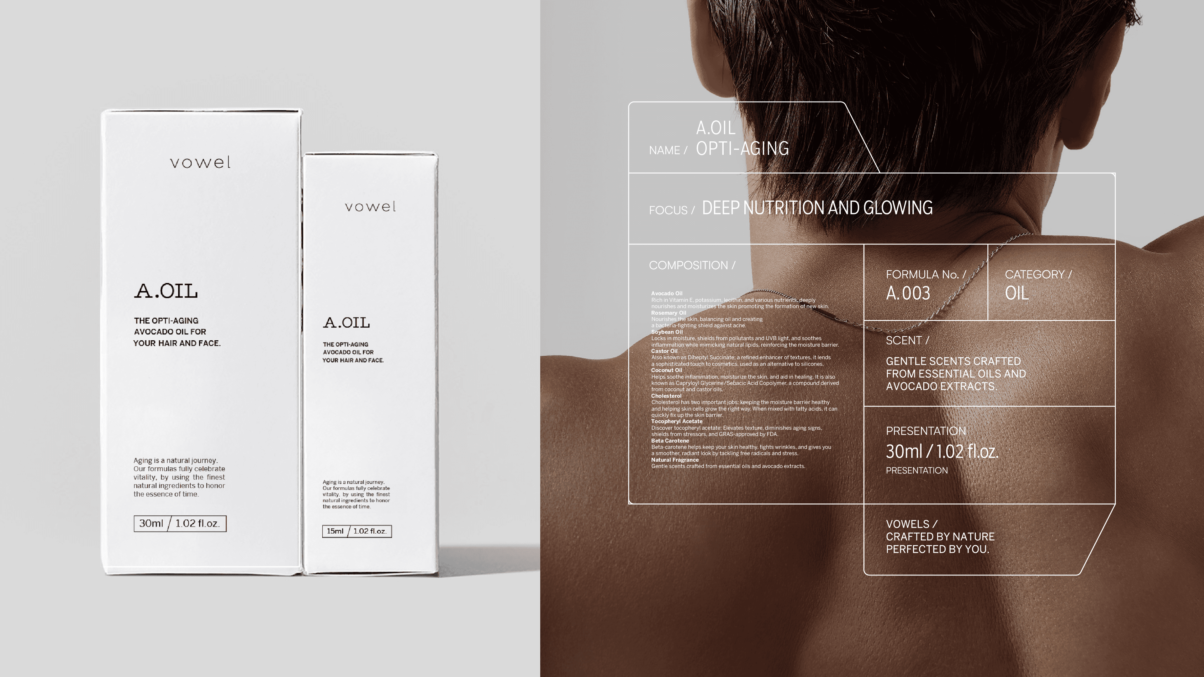
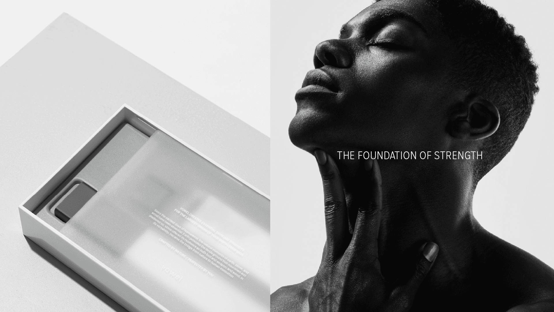
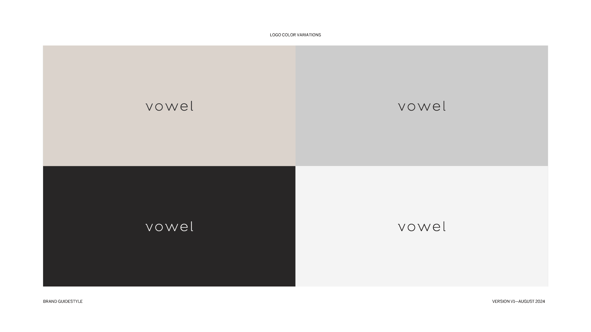
1. Logo System
We designed a minimalist yet bold typographic logo with multiple variations to ensure adaptability across different applications. The logo maintains a strong presence while allowing for flexibility in branding assets.
2. Color Palette
The chosen colors reflect natural elements, emphasizing warmth and sophistication:
Light Wood (#DBD3CC) – Represents organic textures and nature.
Grey Stone (#CCCCCC) – A neutral yet strong foundation.
Carbon Black (#282626) – Adds depth and contrast.
Limestone (#F4F4F4) – Enhances minimalism and purity.
3. Typography System
We selected Salvo Sans Condensed Light for headlines, maintaining clarity and impact with uppercase typography. Benton Sans was chosen for body text to ensure legibility in long-form content, reinforcing a sense of timeless sophistication.
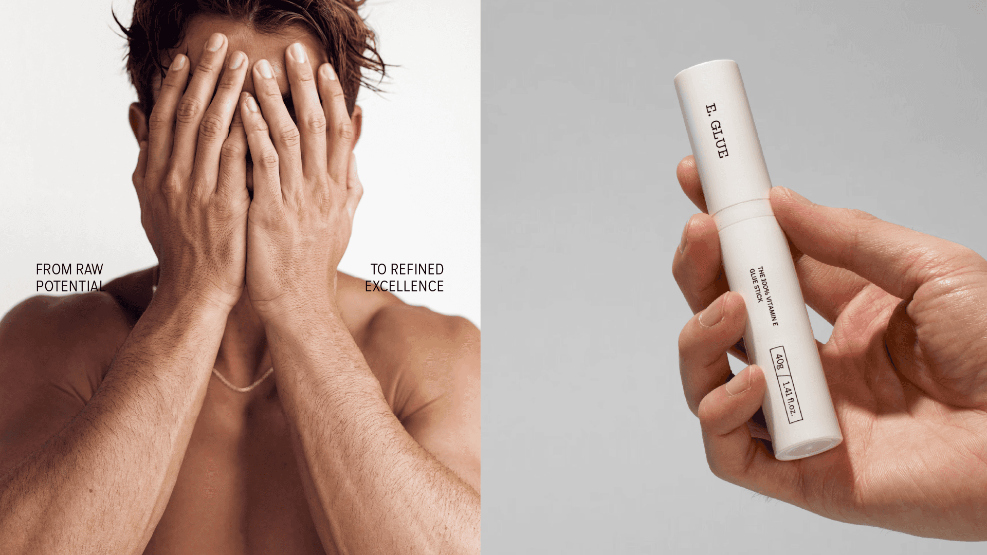
4. Key Visuals & Messaging
We developed messaging and imagery that celebrate the brand’s connection to nature and transformation. Slogans like “Unlock the Power Elements Within You” and “From Raw Materials to Refined Excellence” encapsulate the aspirational tone of the brand.
Results & Impact
Our work provided the brand with a cohesive, premium identity that speaks to its core values. The refined aesthetic has been successfully implemented across packaging, marketing materials, and digital touchpoints, positioning the brand as a leader in the natural luxury space.
Why We Made This
At Selecta Studio, we believe that great design tells a story. This project was an opportunity to showcase how thoughtful branding can transform a company’s perception and create an emotional connection with its audience. By merging strategy with artistry, we crafted an identity that not only looks beautiful but also serves as a powerful extension of the brand’s mission.
Background
Selecta Studio is a design-driven creative agency specializing in brand identity, digital experiences, and high-end visual storytelling. Our mission is to craft identities that seamlessly blend aesthetics, strategy, and functionality. We were recently commissioned to develop a brand identity system that captures sophistication, natural elegance, and a deep connection to foundational elements of life.
Next Project
Vaultflow
->
Vowelskin
Brand Identity and Packaging
Vowelskin
Vowelskin
Brand Identity and Packaging
Tech Stack
Figma
Design Tool
Swift
Programming Language
SwiftUI
User Interface Framework
UIKit
User Interface Framework
Created
2024
Overview
Our client sought a brand identity that would resonate with the ethos of their products—natural, premium, and rooted in timeless elements like earth, stone, and wood. The objective was to create a cohesive visual language that reflects the purity and strength of nature while maintaining a modern and luxurious appeal.
We approached the project by aligning design principles with the brand’s core philosophy. Our process was guided by three key pillars: Authenticity: Ensure that every visual element aligns with the brand’s organic essence. Elegance: Create a refined aesthetic that appeals to a high-end audience. Significance: Design a system that is scalable across digital, print, and packaging while carrying a deeper meaning tied to natural elements and transformation.
Tech Stack
Figma
Design Tool
Swift
Programming Language
SwiftUI
User Interface Framework
UIKit
User Interface Framework
Created
2024
Process
1. Logo System
We designed a minimalist yet bold typographic logo with multiple variations to ensure adaptability across different applications. The logo maintains a strong presence while allowing for flexibility in branding assets.
2. Color Palette
The chosen colors reflect natural elements, emphasizing warmth and sophistication:
Light Wood (#DBD3CC) – Represents organic textures and nature.
Grey Stone (#CCCCCC) – A neutral yet strong foundation.
Carbon Black (#282626) – Adds depth and contrast.
Limestone (#F4F4F4) – Enhances minimalism and purity.
3. Typography System
We selected Salvo Sans Condensed Light for headlines, maintaining clarity and impact with uppercase typography. Benton Sans was chosen for body text to ensure legibility in long-form content, reinforcing a sense of timeless sophistication.
4. Key Visuals & Messaging
We developed messaging and imagery that celebrate the brand’s connection to nature and transformation. Slogans like “Unlock the Power Elements Within You” and “From Raw Materials to Refined Excellence” encapsulate the aspirational tone of the brand.
Results & Impact
Our work provided the brand with a cohesive, premium identity that speaks to its core values. The refined aesthetic has been successfully implemented across packaging, marketing materials, and digital touchpoints, positioning the brand as a leader in the natural luxury space.
Why We Made This
At Selecta Studio, we believe that great design tells a story. This project was an opportunity to showcase how thoughtful branding can transform a company’s perception and create an emotional connection with its audience. By merging strategy with artistry, we crafted an identity that not only looks beautiful but also serves as a powerful extension of the brand’s mission.
Background
Selecta Studio is a design-driven creative agency specializing in brand identity, digital experiences, and high-end visual storytelling. Our mission is to craft identities that seamlessly blend aesthetics, strategy, and functionality. We were recently commissioned to develop a brand identity system that captures sophistication, natural elegance, and a deep connection to foundational elements of life.
Next Project
Vaultflow
->
Next Project
Vaultflow
->
Next Project
Vaultflow
->